
2026 · September redesign · Live app · next release prepared

Later
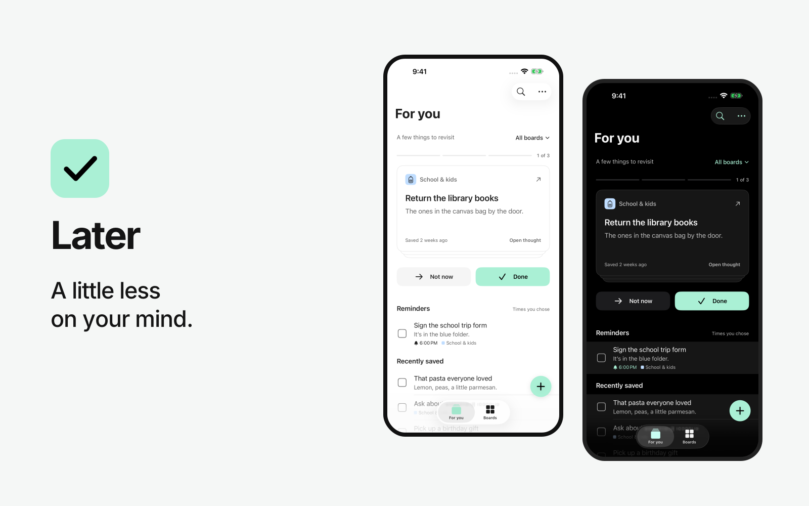
A little less on your mind. A native app for the things busy parents need to remember.
- Role
- Product strategy, brand, UX, SwiftUI, website, release
- Timeline
- 2026 · September redesign
- Status
- Live app · next release prepared
- Stack
- SwiftUI, CloudKit, TestFlight
The starting point
Later started with my wife. She had a system: alarm labels, sticky notes, reminders scattered across apps, and a mental checklist that never turned off. It worked because she kept it working.
The school form needs signing. There might be something at the park this weekend. A birthday idea arrives while you’re doing something else. These things matter, but most don’t come with a useful deadline. I wanted a place that would hold them and bring them back into view without turning family life into a calendar to maintain.
The app was already live. The September redesign made that purpose the organizing principle for the product, its identity, and its website.
Give remembering a clear structure
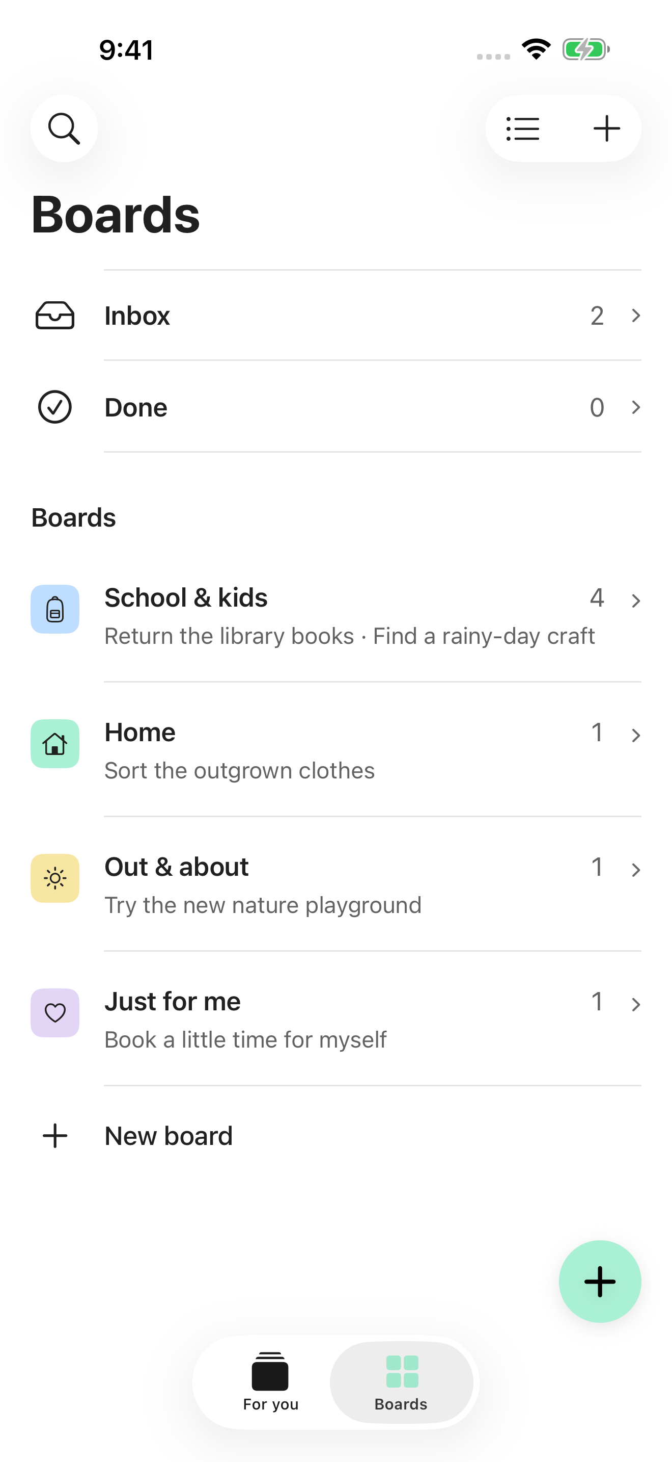
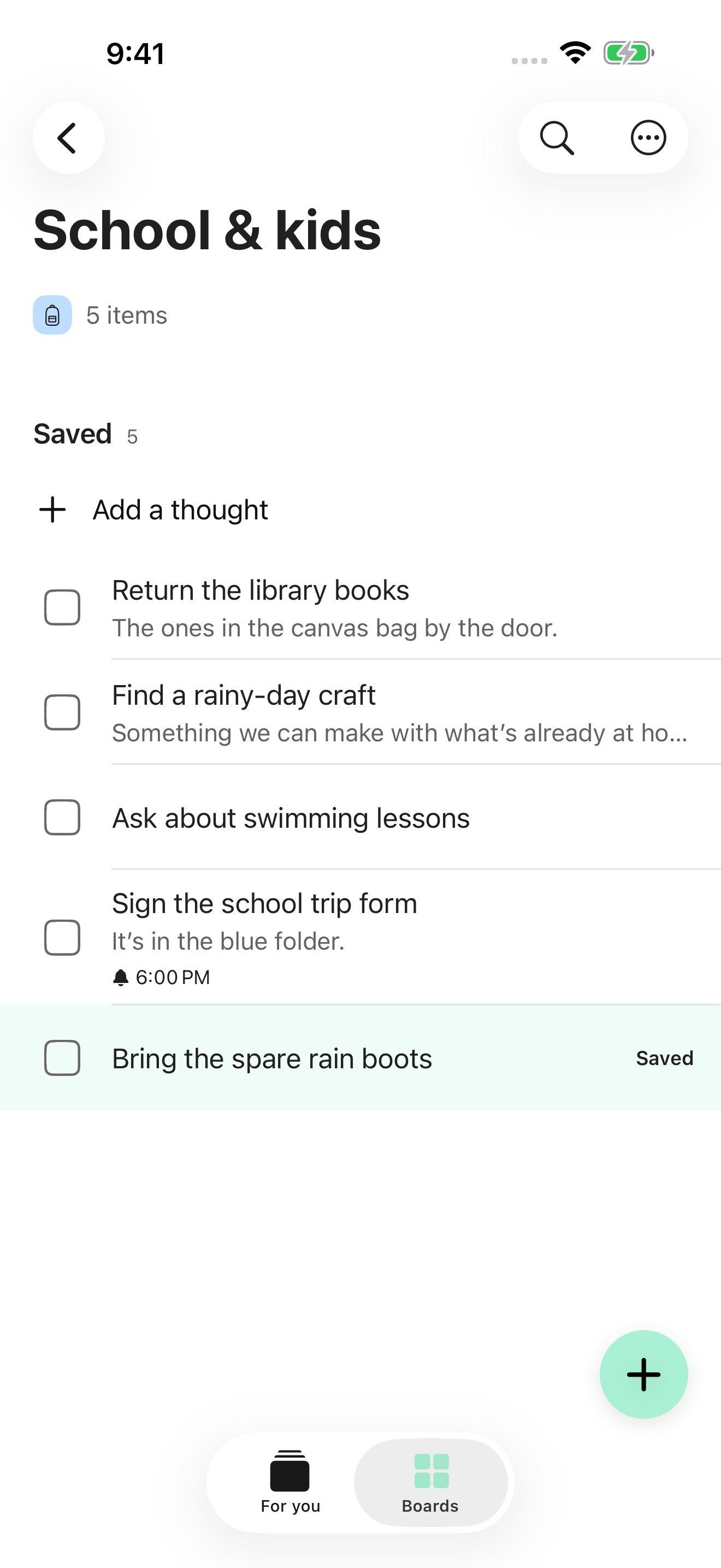
The navigation now has two destinations. For you brings saved thoughts back into view. Boards gives each part of life a place: school, home, errands, and something that’s just for you. Inbox and completed items live alongside those boards.
That distinction matters. Organizing a thought and deciding to act on it are different moments. A board provides context without demanding a date or a plan.
A check-in with an end
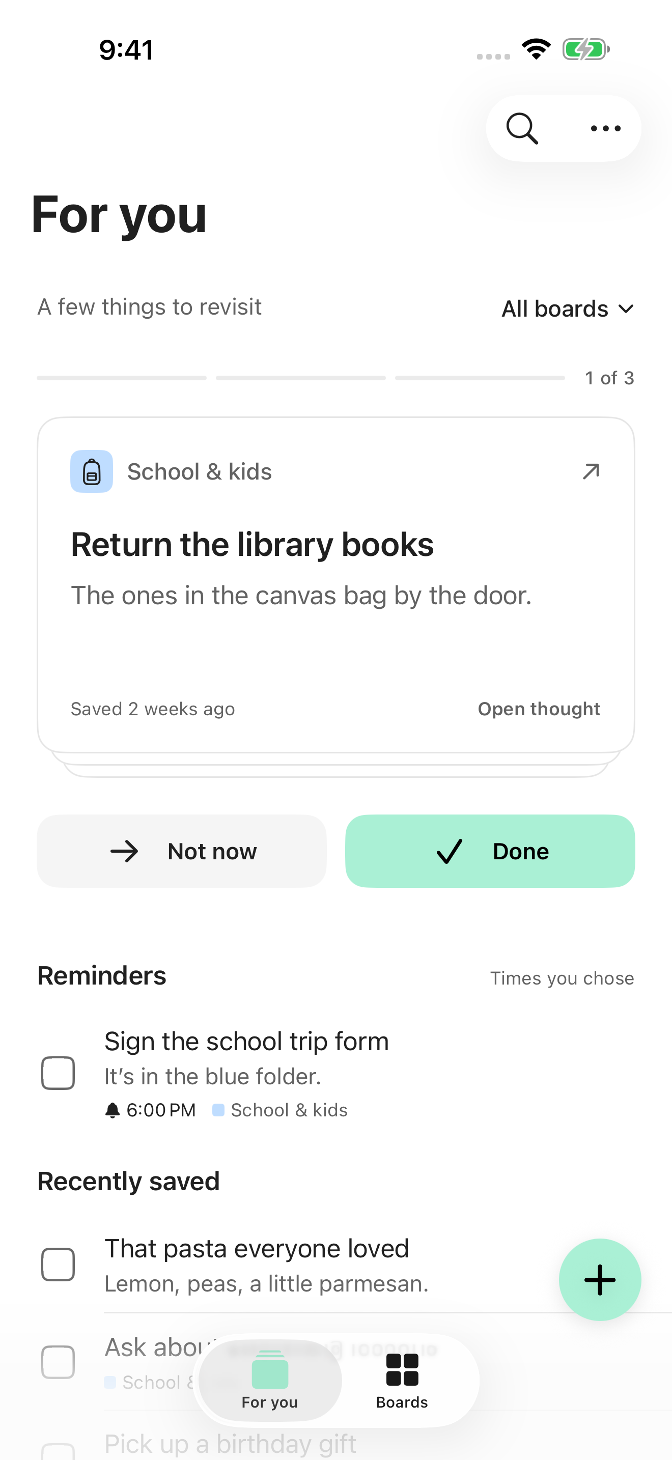
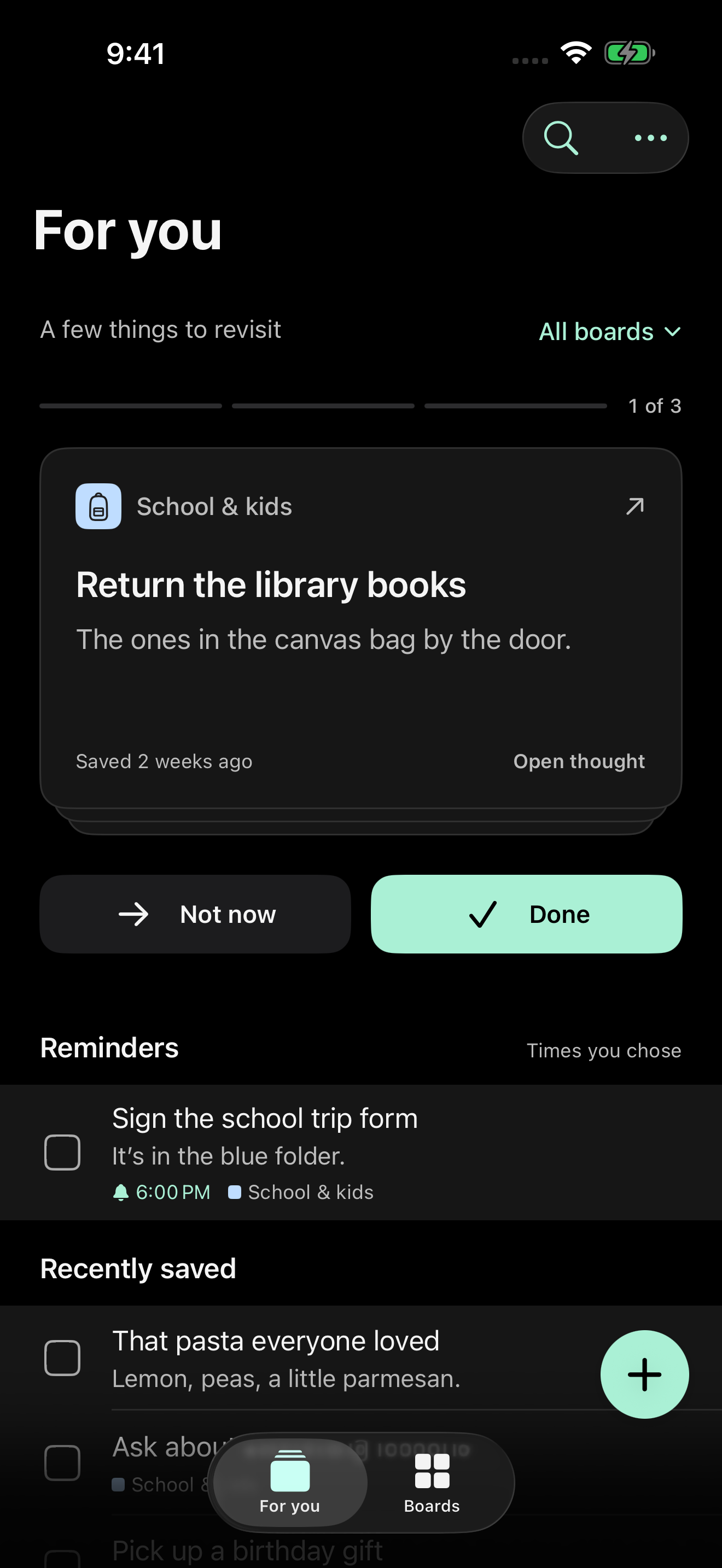
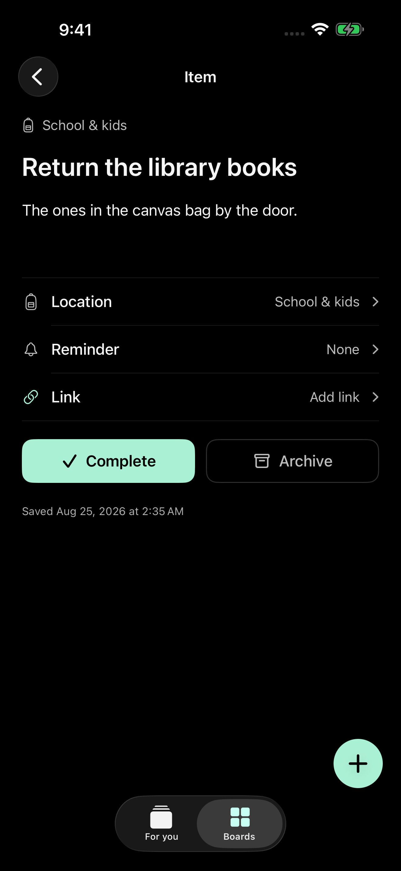
An endless list can make opening a task app feel like accepting more work. Later’s check-in presents three thoughts at a time. Mark one done, put one aside with Not now, or open it for the details. New arrivals don’t quietly extend the session.
A sideways swipe puts a thought aside. Undo brings it back. An ordinary vertical scroll still moves through the page. Those interactions have different jobs, so the gestures need to remain distinct.
The goal is a small return to what matters, with an explicit stopping point. A saved thought can come back later without becoming an overdue task.
Capture without losing your place
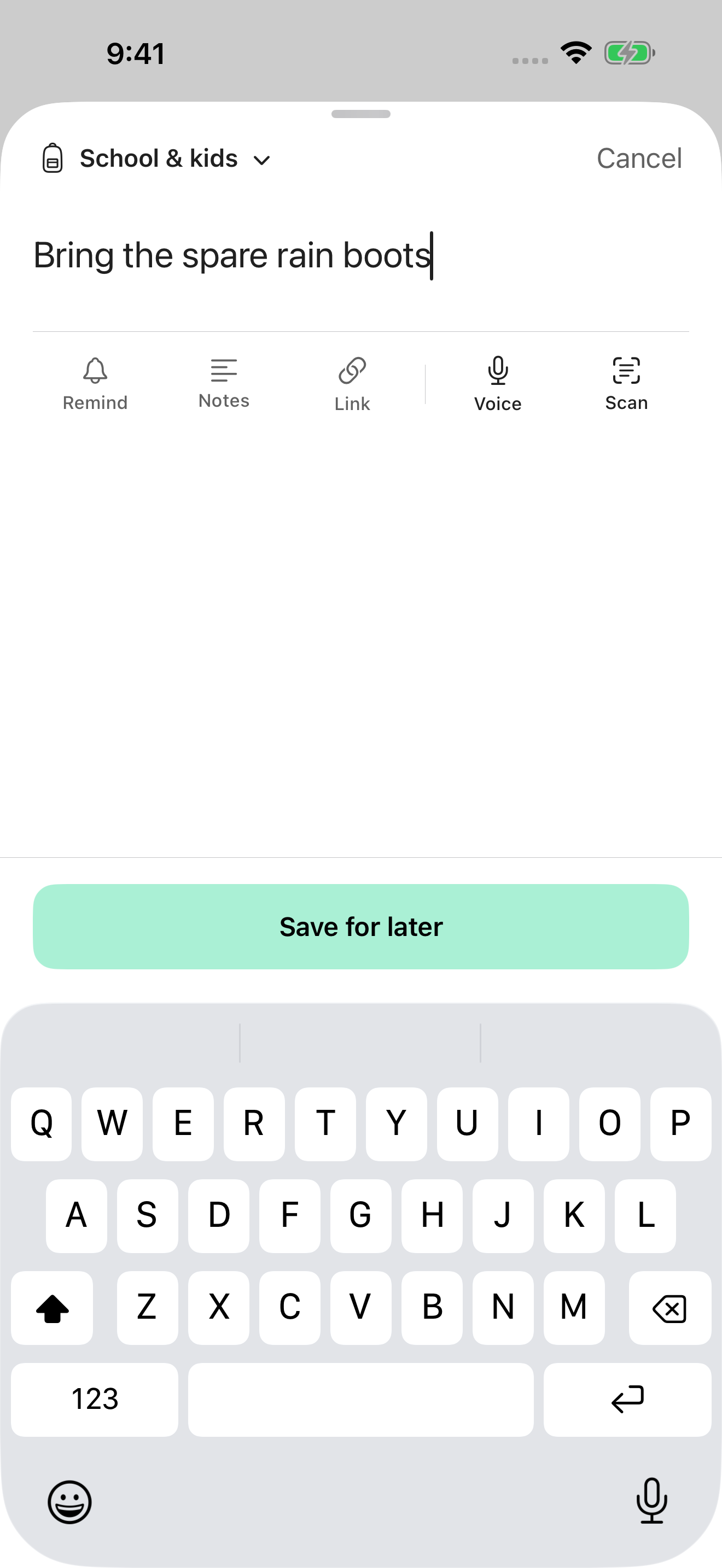
Capture opens as a plain writing surface with the board context visible. Save stays within reach while the keyboard is open. When a thought is saved, Later returns to the right board and reveals it there.
The app still supports speaking a thought, scanning a list, and sharing a link into Later. The redesign concentrates on making the everyday path clear: catch it, save it, continue with your day.
Fewer visual decisions
I moved the interface to white, black, and mint, with native system typography. Mint identifies actions and selected navigation. The dark appearance uses true black and neutral charcoal, keeping the same mint accent.
The icon follows the same restraint: a solid mint square and a simple black checkmark. It needs to be recognizable among the apps someone already uses every day.
The motion supports the task. Opening a thought connects the check-in card to its detail. Saving returns you to your board. Completion and Undo show what changed. Reduced-motion alternatives preserve those relationships without depending on travel across the screen.
From interface to release
I carried the redesign through the native SwiftUI app, the icon, current App Store screenshots, and a simpler product website. The website introduces the capture, boards, and check-in model, with actual app screens supporting the story.
The next iOS build has been uploaded to App Store Connect. The screenshots here show that September 2026 redesign; final App Review submission remains a separate release step. Later’s existing version is available on the App Store.